

Some recent IDA events
8 May 2016
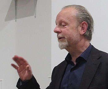
Opposites Attract: The Art and Science of Data Visualisation
Andy Kirk
IN BRIEF: Andy talked talk about the landscape of data visualisation, particularly examining the fine line between form and function, assessing the different styles and functions of designs that exist to fulfil varying purposes.
OUR SPEAKER: Andy Kirk is a UK-based freelance data visualisation architect, consultant, training provider, author and editor of the website visualisingdata.com. His book ‘Data Visualization: a successful design process’ was recently published.
25 March 2016
Brains in Jars, Nuns in Habits
Lucienne Roberts
IN BRIEF: Lucienne talked about a variety of her recent projects including the Wellcome Collection exhibition Brains: The Mind as Matter, which is transferring to Manchester’s Museum of Science and Industry this summer, and Looking Good: Decoding the Nun’s Habit due for publication by GraphicDesign& later this year.
OUR SPEAKER: Alongside studio-based work, Lucienne writes, lectures and publishes. Her books include The Designer and the Grid [Rotovision, 2002] and Good: An Introduction to Ethics in Graphic Design [AVA Academia, 2006]. She teaches and lectures internationally and is external examiner of BA Typography and Graphic Communication at Reading University. Her latest book, Design Diaries: Creative Process in Graphic Design [Laurence King, 2010] was co-written with design educator and writer Rebecca Wright.
25 February 2015
Making a Legible City
with Mike Rawlinson
IN BRIEF: Mike spoke about his experience working across disciplines to develop unique design, information and wayfinding solutions to improve user experience of cities, places and spaces.
OUR SPEAKER: Mike Rawlinson is the founding director of City ID, a studio based in Bristol and New York. Mike has been a visiting lecturer at the University of Edinburgh, the Scuola Politecnica di Design in Milan and University of Urbino in Italy and has advised cities and organisations in Belgium, Brazil, Germany, Italy, Japan, Poland, South Korea and Spain on wayfinding, city image and identity issues
We have a recording of Mike’s talk, which will soon be processed so you can download it from this site.
29 January 2014
Inventing the timeline — a history of visual history
with Stephen Boyd-Davis
IN BRIEF: Designing a timeline of events seems like a pretty trivial exercise in visualisation. Stephen highlighted some of the difficult and subtle decisions actually involved. What shape is time and how should it be drawn? The talk emphasises innovations during the eighteenth century, when these questions were raised for the first time.
OUR SPEAKER: Dr Stephen Boyd Davis leads staff research activities in the School of Design at the Royal College of Art. His personal research is concerned with visual representation of historical time, especially in interactive digital media.
We have an audio recording (with Stephen’s permission) of this talk, at one hour and twenty minutes, together with his slide-set (182 slides), converted to PDF. The slides include some fascinating examples of early timeline design, with detail you will want to pore over... To make it easy for you to listen to the audio recording and follow the slides at the same time, we have added to the ‘left’ of the stereo audio mix a voice prompt (‘slide seven...slide eight’ etc) to help you keep in sync.
21 November 2013
Balance: Presenting election data at the BBC
with Jonathan Spencer and Mark Edwards
IN BRIEF: Our speakers looked at the design evolution of the BBC’s full form general election results graphics and associated screen architecture since 2005 — and the 2010 data table for predicting likely coalitions. They also presented about the newer development, developments since 2010, using Virtual Reality and Augmented Reality approaches.
OUR SPEAKERS: Jonathan Spencer is the Creative Director for Virtual Reality Strategy in BBC News: he has seven BDA awards for television work and two for interactive design work to his credit. Mark Edwards is the lead designer for BBC broadcast election specials.
15 October 2012
Data Journalism: a designer’s perspective
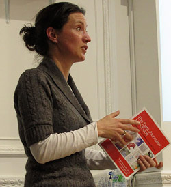
with Lulu Pinney
IN BRIEF: The internet has had a profound impact on journalism, as it has on many things. The vast quantity of data the internet has enabled us to discover, collect, explore and share is part of this. Visual design provides a powerful tool for finding and telling the stories contained within data.
Data journalism spans several disciplines: designers have much to contribute, and much to learn.
OUR SPEAKER: Lulu Pinney describes herself on her LinkedIn page as an ‘Infografista – a person who explores, harnesses and then visually communicates information in a useful and digestible manner’. She was educated to become a ‘numbers person’, but she became equally curious about pictures and words. Lulu gained design experience at Pentagram, Haymarket Business Publishing and BBC News Online. She now teaches about and creates infographics, and writes about it on her blog Telling Information.
Note: Lulu Pinney is also associated with The Data Journalism Handbook: a free, open source reference book for anyone interested in the emerging field of data journalism. It’s a collaborative effort involving dozens of data journalism’s leading advocates and best practitioners — including from the Australian Broadcasting Corporation, the BBC, the Chicago Tribune, Deutsche Welle, the Guardian, the Financial Times, Helsingin Sanomat, La Nacion, the New York Times, ProPublica, the Washington Post, the Texas Tribune, Verdens Gang, Wales Online, Zeit Online and many others.
The Data Journalism Handbook is published by O’Reilly, but is also freely available as a Web edition online.
A sample of past IDA London meeting topics & speakers
| Opposites Attract: The Art and Science of Data Visualisation | Andy Kirk | 8 May 2013 |
| Brains in Jars, Nuns in Habits | Lucienne Roberts | 25 March 2013 |
| Making a Legible City | Mike Rawlinson | 25 Feb 2013 |
| Inventing the timeline — a history of visual history | Stephen Boyd-Davis | 29 Jan 2013 |
| Balance: Presenting election data at the BBC | Jonathan Spencer and Mark Edwards | 21 Nov 2012 |
| Data Journalism: a designer’s perspective | Lulu Pinney | 15 Oct 2012 |
| Film premier: Push the Button | (Film show) | 18 Jan 2012 |
| The Diagram Group (a history of its work) | Bruce Robertson | 21 Feb 2011 |
| Pictopolitics – Icograda and the development of pictograms: 1960–1975 | Wibo Bakker | 27 Oct 2010 |
| Information design and visual storytelling: Graphics in Exhibitions | Jona Piehl | 21 June 2010 |
|
Designing information before designers: print for everyday life in the 19th century |
(?) | 21 Dec 2009 |
| Isotype revisited | (three speakers from Uni. of Reading) | 18 Nov 2009 |
| Mapping international crimes | Chris Campbell | 4 Nov 2009 |
| Organizing knowledge: a few suggestions | Per Mollerup | 10 Feb 2009 |
| The Communication Benchmark Project at CRI | David Sless | 29 June 2009 |
| Look at the World – News Information Graphics in 2008 | Max Gadney | 2 Dec 2008 |
| Text visualisation: two approaches | Stefanie Posavec & Piotr Michura | 16 Sept 2008 |
|
Fragments that flow: Information design and ‘web 2.0‘ |
Matt Jones & Matt Biddulph | 1 July 2008 |
| Pictures and Words: towards a visually-led information narrative | Bryn Walls (Dorling Kindersley) | 28 May 2008 |